


I'm a Good Surgeon...or am I? (Part Two)
The numbers may lie.

This is the second part of my analysis of a report provided to me by a physician performance rating startup. Part One, included an in-depth breakdown of the 11 metrics the company used to arrive at my overall score (a solid if not spectacular 68/100 — 50 being market average). To summarize, I found the metrics to be a mixed bag in terms of their relevance and importance with an unclear relationship to quality of care. The metrics seemed to skew more towards the employer/payer side with a heavier focus on utilization management and less focus on direct costs, patient reported outcome measures, and patient experience.
In this article, we’ll look at the second part of my performance report — a table that provides a touch more granularity to the 11 metrics. Additional data includes the number of instances per metric (“numerator”), number of total cases per metric (“denominator"), a case rate (“initial measure rate”), and something the company is calling the “adjusted rate.” I’m not entirely sure what the “adjusted rate” represents — perhaps an attempt to weight the scores and arrive at the Overall Performance Score. As discussed in Part One, the company provides a link to descriptions and details of the measures, but it does not provide insights into methodology. In fairness, a link is provided to schedule a meeting with one of the company’s team members to discuss the report in detail. Full marks for transparency and a willingness to engage providers.
Without further ado, here’s the chart:
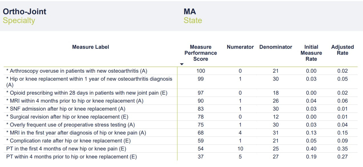
The most glaring data point on the chart is the low number of cases in the “denominator” category. According to the report, data was pulled from a 4-year period ending in December 2021. The company uses a third-party vendor that aggregates data from commercial and governmental insurers. In theory, the data should be fairly comprehensive. Even taking into account COVID-related drops in volume, these numbers seem perplexingly low. In a 4-year period, I would typically perform well over 1,000 joint replacement surgeries and complete well over 10,000 office visits. As discussed in Part One, I have a heavily sub-specialty focused practice that includes a large number of patients with hip and knee pain/arthritis who would quality for the metrics chosen. I’m an Orthopedic Surgeon not a statistician, but denominators in the range of 20-30 would seem to risk significant sampling bias. Without a clear sense of the methodology, it’s impossible to speculate on how these cases were chosen and if they are representative of my broader practice. The mixture of sources from which the data was obtained (commercial v. government, claims data v. EMR, etc.) is also a mystery.
With such small denominators, even a single point change in the numerator (up or down) would significantly affect the Initial Measure Rate and Adjusted Rate categories. For instance, one additional complication after hip or knee replacement would double my rate from 5% to 10%. Reporting on as many cases as possible would provide a more complete and accurate picture of my actual outcomes while reducing the chance of sampling error. It’s possible that this small number of cases is representative of my practice in totality and that adding more cases wouldn’t change the rate (i.e., the numerators and denominators would go up in proportion). It’s also possible that the company’s methodology is refined enough that a larger sampling isn’t necessary. Still, it’s concerning that scores are being calculated on data that represents less than 3% of my operative practice and less than 0.3% of my office visits over the 4-year period. While I’d love to be able to claim only one postoperative complication and a 0% revision rate over the past 4 years, I’d be lying.
The final consideration when evaluating this second chart is determining how the Measure Performance Scores (MPS) were calculated. I assume my Adjusted Rate was compared to other “Ortho-Joint” surgeons and/or some distribution curve to arrive at a percentile score. What’s interesting is that while I had no surgical revisions, my MPS was only 78/100. It’s hard to do better than zero in this category, but perhaps the small denominator led to my Adjusted Rate of 0.01.
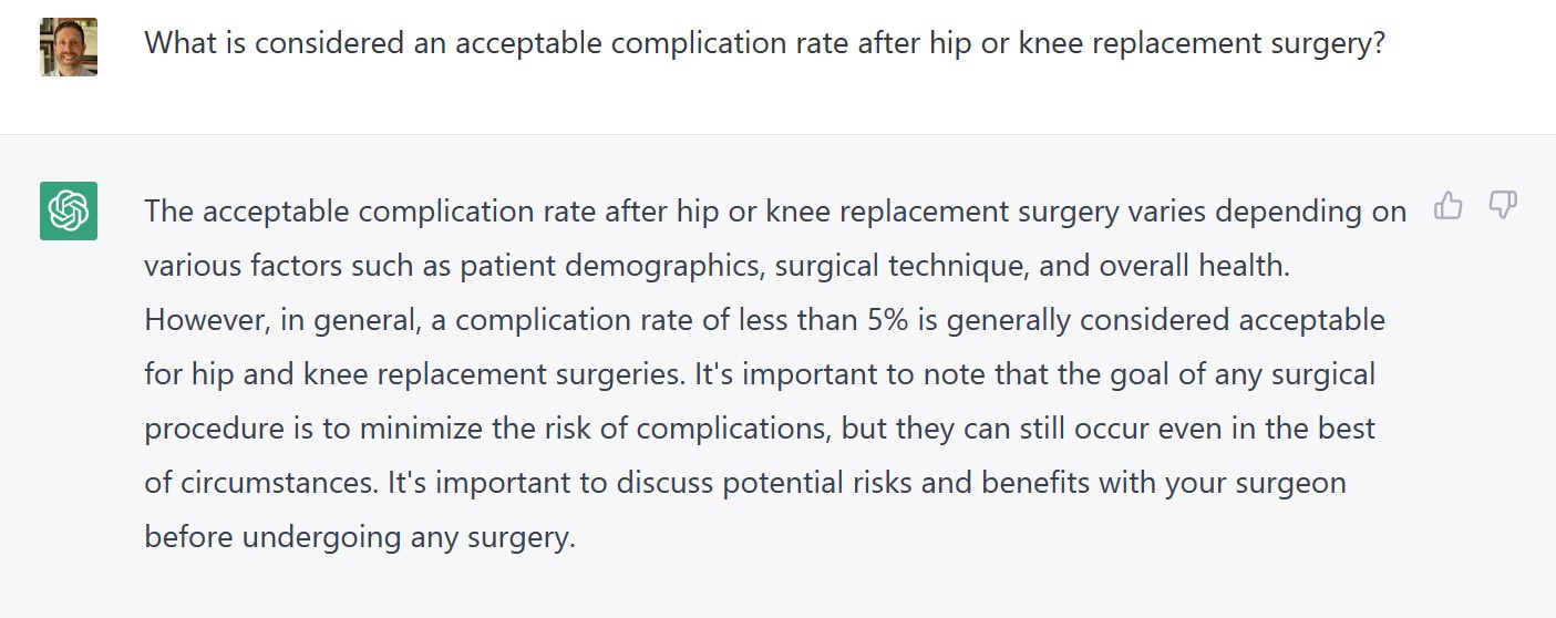
The obligatory ChatGPT screen capture. My one surgical complication (out of 21 cases) equated to an Initial Measure Rate of 0.05 (5%) with an Adjusted Rate of 0.09 (9%). As the ever-diplomatic ChatGPT points out, my unadjusted complication rate of 5% falls right at the generally acceptable level, leading to a Measure Performance Score of 59. If Market Average is 50, my score of 59 (slightly better than average) makes sense in the context of an average complication rate. What’s missing here is context. If the Measure Performance Scores reflect some comparison to other “Ortho-Joint” physicians, how do we ensure an apples-to-apples comparison? One of my biggest concerns with healthcare quality and outcomes comparisons is making sure that data is appropriately adjusted for risk and case complexity and that data collection methods are comparable. Failure to do so unfairly punishes physicians who take on more complicated cases (for instance, those at tertiary referral centers or those with large referral practices) and potentially encourages cherry-picking and lemon-dropping. Data without context can make a good doctor look worse and a not-so-good doctor look better. Data reporting can also be widely variable from one geographic location to another or from one health system to the next.
In summary, we must be cognizant of the limitations cause by using flawed, incomplete, non-contextual data to make definitive, accurate determinations regarding care quality. That does not mean such efforts are without merit. To be sure, such ratings systems are expected to become the norm as focus shifts (painfully slow as it may be) from FFS to VBC. Employers and payers (commercial and governmental), want to make sure they are getting the most bang for their buck. How do we improve the ratings process to ensure the intended goal (better informing patients) is achieved?
Here’s some thoughts:
1. Collect Better Data
We know EHRs have mostly failed as repositories of high quality, actionable data despite their pervasiveness. EMR cloning (the process of cutting and pasting medical notes) obfuscates the clinical picture and muddles the data. A 2017 study found that only 18% of text from 23,630 inpatient progress notes was entered manually whereas 80% of notes were imported or copied from elsewhere. Upcoding, the practice of adding diagnoses to the medical record or making patient care seem more complicated (often to increase reimbursement), is a source of controversy. On the one hand, coding should accurately reflect patient and case complexity. On the other hand, stretching the truth for billing purposes further clouds things (not to mention the ethical issues). As discussed previously, conclusions made from data analysis are only as good as the data upon which they are based. Inconsistency, redundancy, and conflict within data significantly limits the validity of scoring measures. To be fair, the company who provides this report is at the mercy of the data available. Patient reported outcome measures, price/cost data, and quantification of physician soft skills are either not widely reported or are opaque.
2. Decide What’s Important
What’s important varies from one stakeholder to the next. Surgeons are more likely to emphasize complication rates and their own perception of what constitutes a successful outcome. Primary care providers (an underappreciated beneficiary of specialist rating tools) may value access, ability, and affability. Patients place more importance on engagement, communication, and experience. Additionally, many patients value (perceived) quality more than cost — despite employers/insurers efforts to steer them to preferred providers. The metrics used in this example seem to skew more toward the insurer/employer side of things and may include measures of lesser importance to patients. Of course, deciding what’s important is a matter of perspective. Aligning IncentivesTM is easier said than done. The real answer lies in finding a mixture of metrics that reflects the right balance of quality and value measurement for all involved. The least expensive care isn’t always the best. More expensive care may be worth it depending on the longitudinal value it provides. Perceived quality based on brand reputation, word-of-mouth, or similar subjective measures is antithetical to leveraging data to make the best, most informed decisions. I suspect as these performance rating systems continue to evolve and the algorithms improve, it will become easier to surface the proper metrics. Any data-driven, AI-based analysis should be a living, breathing process constantly getting better.
3. Take Ownership
Here’s the reality for providers: the best way to adjust to these coming changes is to take ownership of the data collection process. Some forward-thinking physicians and physician groups have been on the forefront of this movement. Collecting your own data helps maintain control over the process, ensures the quality of data collected, and improves negotiating leverage. Definitively demonstrating the quality and cost-effectiveness of the care you provide can be a powerful tool and significant differentiator. (As a prime example, I suggest listening to Stacy Richter’s excellent Relentless Health Value podcast episode with Dr. Scott Conard.) Facing the data can be anxiety-inducing for doctors. We have a general sense of our quality and outcomes but tend to overestimate just how good we are. A survey of 242 Orthopedic Surgeons found that 25% considered themselves in the top 5% of surgeons. But embracing transparency and taking ownership of data will be a necessity in the near future. Abdicating this process to third parties is unlikely to be a recipe for success — which brings me to my final point.
4. Collaborate
As mentioned previously, the company who provided this report deserves credit for its willingness to elicit feedback from providers (rather than simply subvert them). Everyone benefits when the involved parties collaborate — the proverbial rising tide lifting all boats. Too often when it comes to navigation services or ratings systems, the narrative becomes about Avoiding Unnecessary TreatmentTM , blame, and finger-pointing. Patients will benefit when data collection improves, and they can make truly informed decisions. Payers and employers benefit when they can accurately identify high-value providers and cost-effective care. Doctors benefit by having objective information upon which to improve care delivery, and providing evidence of high-quality care is a powerful negotiating tool. Most importantly, collaboration infuses trust back into the system and sets a common goal.
Thanks for reading the inaugural two-part post of my Dem Dry Bones newsletter! Stay tuned for more.
Nice assessment! I think the problem that you highlight is one that is really important for AI to tackle, and when it does, it’s gonna be a remarkably more powerful tool. Essentially, humans have a really good bullshit gauge. We can look at a numerator of 31 out of what is likely to be thousands of cases and know it’s bullshit. I have looked at large claim, status, hats, and known they were incorrect, because the population provinces of concurrent diagnoses I was seeing were impossible--there is no world in which 50% of patients with schizophrenia also have autism in hundreds of patients. So training AI on the kinds of things humans are using to determine whether with her thing is bullshit or not is gonna be crucial.